Sort of gives new meaning to the term “getting hammered”.
Which is why we are staying away from “Hammer” as a logo. I don’t want to target drunks and young kids who want to get “Hammered”. That’s not our goal with the name. Our main goal is to appeal to Alabama residents and hopefully (eventually) folks abroad. We want to represent Alabama without being looked on stereotypically (red neck, etc.) The name “Yellowhammer” represents alabama without conjuring up *rebel flags, pick up trucks, trailers and {insert your stereotypical comment here} ;)
*Unless you take into consideration that the Alabama Soldiers during the Civil War were known as the “Yellowhammers” due to the yellow highlights in their uniform. Hence the origin of the Alabama state bird.
OK - Sat down yesterday and this morning and dialed it in a little more thanks to all of the great comments I got from people here and elsewhere. I do think that this one might be more approachable, especially for our theme. One of the best comments I got was that the FYV2 was too industrial. Here’s a more organic version. Comments welcome and appreciated.
Looks really good.
At first glance it reads…Yello-Whammer…which would also be a good name. ;D
Like I said over there
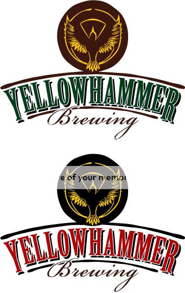
The bird from #3 there and its GOLD
Still VERY NICE though, classy yet mysterious (cue Rush album)
A lot of people have given negative comments on the “bird” drawing on #3 and, I admit, it doesn’t really look like a Yellowhammer. I’ve had a really hard time actually drawing the bird correctly (it’s an odd bird to draw, the best one I did (not pictured here) captured the likeness perfectly but was too “Audubon Society” looking and had too much detail to simplify correctly.
Plus we have to have a stamp to put on kegs and I want the Y and the Bird to be incorporated together.
Got yah, that makes sense
FWIW
I have two pairs that breed on my property every year
Noisy bastards, pretty bird in flught though
Definitely like the new version but I agree with Bluesman on this. Maybe mess with the font size a little and make the Y and H slightly higher than the other letters?
Actually, I’m not so worried about the font. I just slapped that on there. Just concentrating on the brand. I need something extremely simple that will brand us (something that will work both in color and Black and White). Here:

In that case, I like it.
Very nice…I think that’s a winner.
Keith, I’m likin’ the new one a LOT! Very classy and it gets your point across.
Yeah, I could definitely get with that one.
Actually, the “bird” on #3 was it’s biggest selling point to me. I always find it easier to “simplify” a logo when working from a picture of the actual thing. Maybe something like this as a good starting point…
Now, that’s a good logo.
I’m liking your latest revision a lot better than the first 5 options; it’s a lot cleaner and easily recognizable.
Logos are symbolic representations (where features get simplified or exaggerated to facilitate recognition).
As long as the creative juices are flowing, I wouldn’t abandon the “hammer” tag line idea just yet–Your brewery is named YellowHammer, after all.
I don’t recommend it being used in the context of “Let’s get hammered (i.e., drunk)”, as you’ve mentioned, but, rather, in more clever twists of common expressions. For example, husband asking his wife or carpenter asking his co-worker “Have you seen my hammer?” or “Try this Hammer…” or birdwatchers (wearing roll tide t-shirts) looking through their binoculars at a YellowHammer (beer, not bird), and exclaiming, “Oh, look! A YellowHammer!” I’m sure you and others will come up with something far better. Better branding and taglines, along with a great product, will sell more beer.
I understand and respect your desire to promote responsible drinking, but you are not responsible for the drinking habits of others.
Young college kids and drunks looking for a cheap buzz won’t be as likely to inbibe craft beers due to cost.
Only problem with invoking a hammer at all is that it completely clouds an already somewhat cloudy marketing message…the connection between yellowhammer and the bird of that name is a bit obscure to us out-of-towners and showing a hammer or using a hammer in a marketing sort of way confuses that somewhat fragile connection. If a literal hammer is invoked, people are more likely to take the name more literally, and then be more confused by the bird in the logo.
If you’ve picked the little avian fellow as your brand image, adding an actual hammer in will likely only complicate and confuse the branding, I think. But then, I’m not paid the big bucks for marketingspeak!
Yep, I dig the new logo. Lookin’ good!
The second one really pops to me . . Something about the red font moves me to action . . .
That is THE ABSOLUTE BEST shot of the Yellowhammer I have seen!!! and you have no idea how hard I have searched!!! thanks for that!!!
I like the new iterations the best by far. Nice job!!!
Fred